
I Just Wanted a Better Chat Window
An afternoon with the new /design skill in Claude Code. The result: 64 contrast violations and the realization that an old test was worth more than the entire design.
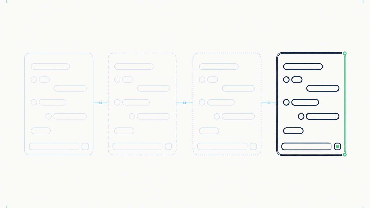
Measure first, then paint
A light green button on a white background, labeled with white text. That's exactly how the suggestion button looked in my Odoo chatbot after I selected the "Forest Green" color scheme. Clicking worked. Reading did not.
I actually had something else in mind that day. Claude Code has recently added a/design skill, an early preview of the Canvas editor from Claude Design, and I wanted to know if it would produce a prettier chat window. So I gave it both tasks: look at the color schemes and show me design variations.

Instead of drawing immediately, Claude measured. For all ten delivered color schemes, the actually rendered colors were read via browser automation, the effective background was calculated through the parent chain, and contrast ratios were determined according to WCAG. All numbers in this article come from this measurement. Result:64 violations. The suggestion button was at 1.00:1, white on white, mathematically invisible.
The cause was a single class. Our backend theme colors buttons in the system tray white, and my chat window hangs in exactly that tray. There had been a protective rule against this for months. In CSS, when rules compete, specificity decides, roughly speaking: whoever names more classes in the selector wins. Our protective rule was written against an opponent with three components. Sometime the theme rule got a.o_web_client prepended and had one more. As a result, not a single element was lost, but the entire protection file: message links, paperclip, copy button, all buttons of the conversation history. Nothing exploded. The window simply became silently unreadable.
Four drafts on one surface
Then came the design phase. I received a canvas with four artboards: on the left, the repaired current state as a comparison, next to it three directions, each with one nameable idea.
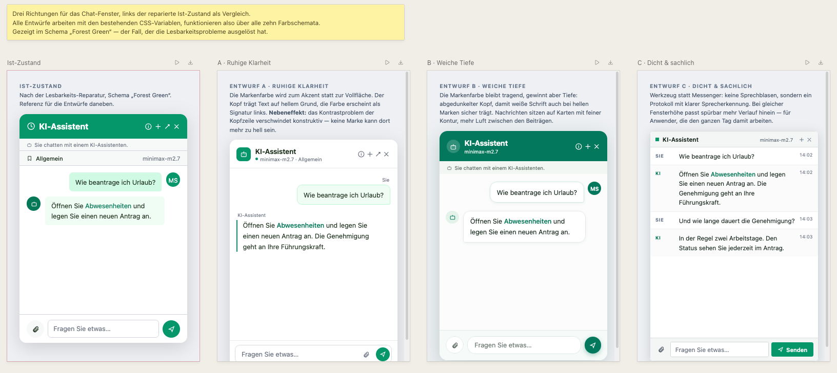
Variant A convinced me, and not because of the look. It removes the brand color from the header and leaves it only in the button for the conversation history. This solves a problem I would otherwise have been stuck on: on a colored bar, the title must stand out against the freely selectable primary color, and with medium-light brands, this creates no text color. At#059669 the maximum is 3.90:1, whether you set white or black on it. On a light background, it is 14.49:1.
From a design decision, a technical solution emerged.
The draft omitted the mandatory notice
And then the point that concerned me most. In my chat window, there is a sentence above the conversation: 'You are chatting with an AI assistant, not with a human.' It is there due to Article 50, paragraph 1 of the EU AI Act.
In the design mockup, it was not visible.
It became apparent because I had written four regression tests for it months earlier. They verify that the notice exists, that it is not tied to a condition, that it appears above the conversation history and input field, and that its text comes from a fixed constant rather than a customer configuration. The header comment in this file explicitly states its purpose: to catch someone who would omit the notice during a redesign.
Exactly that happened. Only this time, the person was an AI, and the test still passed.
I am stating this so clearly because the more convenient version of the story would be incorrect. The AI did not implement the EU requirement on its own. It would have lost the notice in the draft. What saved it was work I had done beforehand.
566 tests and zero contrast violations
In the end: 566 tests green, no more contrast violations across all ten schemas, plus four new guardian tests that will henceforth report if this specificity margin flips again. By the way, the follow-up run also found seven contrast errors in the mockups themselves. The same negligence that had just been repaired.
I work with Opus 5. I tried Fable 5 but found no advantage for my tasks that justifies the cost; the agents use Sonnet or Haiku for simpler steps anyway. Roughly, I estimate that more than 90 percent of my daily workflows run automated. I handle texts and graphics and perform the final tests myself.
What I take away from the day is less comfortable than "the tool is good". It only helps as far as the prior safeguards extended.
Created by Martin Schmid, with support from Claude Opus 5 and approved after independent content review. Our terms apply. Notes and Disclaimer.